The Home Depot
Optimizing the Online Carpet Sample Purchase Experience
The carpet samples buying experience on HomeDepot.com is neither obvious nor easy for customers to navigate, despite the fact samples are one of the most important decision-making tools in the carpet buying journey. The only purchase path for samples today requires customers to navigate through individual carpet product information pages (PIPs) to discover and buy.
Role
Sr. UX Designer
tools
Figma, Jira, Usertesting.com
platform
Native, mWeb, dWeb
timeline
10 weeks
The Challenge
What is the customer problem?
Currently, special order carpet buyers don’t have a clear idea that carpet samples are available and ready for purchase from the product listing page (PLP), they need to click through to the product information page (PIP) to see availability.
For the business, the call to action on the PLP looks like a dead-end and we don’t see frequent click through to PIP from PLP. For other flooring classes, conversation increases 39% on average when customers buy samples, suggesting samples significantly increase the likelihood of conversion. Installed carpet customers in particular rely on samples to evaluate the look and feel of the product before purchase, as the carpet can only be custom ordered.

Business objectives
What Targets is Home Depot Striving to Hit?
While addressing the customer's issues, it's equally important to identify and define the specific business objectives of Home Depot. This dual focus ensures that our solutions not only resolve customer challenges but also align with the strategic goals of the company.
Sell more carpet with less friction
Increase the number of samples added to cart and eventually sold
Increase conversion on special order carpet and professional measures
the solution
Streamlining Carpet Sample Selection
Carpet samples play a pivotal role in the decision-making process, instilling confidence in customers by facilitating direct comparisons between options. Our objective is to streamline the process for special order carpet buyers, ensuring they are promptly aware of sample availability within their desired carpet category. By implementing a feature enabling users to effortlessly add samples directly from the Product Listing Page (PLP), we aim to enhance the user experience and expedite the path to purchase.
THE PROCESS
Utilizing the Triple Diamond
In this project, I leaned on the Triple Diamond design framework, which unfolds in three phases: Discover, Define, and Develop. It all kicks off by delving into user needs, then moves on to pinpointing specific challenges, and wraps up by crafting and testing solutions. This structured process ensures that the end product hits the mark in meeting user expectations and needs.

DISCOVER
The Problem Space
Over a focused 2-week research sprint, I delved into understanding and researching the problem space. This involved visualizing user attitudes and behaviors, evaluating the efficiency and simplicity of the current design, and understanding the competitive landscape to identify strengths, weaknesses, and opportunities. This comprehensive approach allowed for a thorough analysis of the existing conditions and potential areas for improvement.
Based on our data, a person who orders a carpet sample buys the product 31% of the time compared to 0.7% when they don’t buy a sample. This customer spends on average $55.73 and the transaction happens 13 days after they order a sample.
Among customers, 31% who purchase samples compared to just 0.7% of non-sample buyers, indicate a significant inclination towards sampling before buying. Additionally, the average number of samples per order is 3.6, demonstrating that customers typically explore multiple options before making a decision.
research & inspiration
Market Research
When strategizing the approach to the new onboarding experience post-sign-up, I conducted an analysis of several subscription-based services including Hulu, Noom, Strava, Zero, DoorDash, among others. My examination focused on confirmation messaging, guidance on initiating the use of membership features, and immediate user actions. Findings include:
Some apps featured a minimalist confirmation screen with a single call-to-action, encouraging users to start exploring or proceed to the main homepage without additional features.
Others feature a multi-screen onboarding experience with congratulatory messaging, detailed exploration of key features and benefits, and culminating in the personalization of the member experience.
A few follow the generic iOS app purchase confirmation popup, swiftly transitioning users to the main homepage with no further direction.
ideation
Mid-Fidelity Wireframes
Following a thorough examination of market research and requirements, I considered the optimal approach for meeting user needs across all devices: a scrollable single-page design or a multi-page onboarding experience. After careful evaluation, I opted for a single-page version that prominently displays three content zones at a glance, eliminating the need for users to navigate through multiple screens. Our primary emphasis on this confirmation page lies in member appreciation, initiating onboarding, and fostering awareness of benefits.
mobile wireframes


desktop wireframes


leadership support & alignment
Working to Find the Best Solution
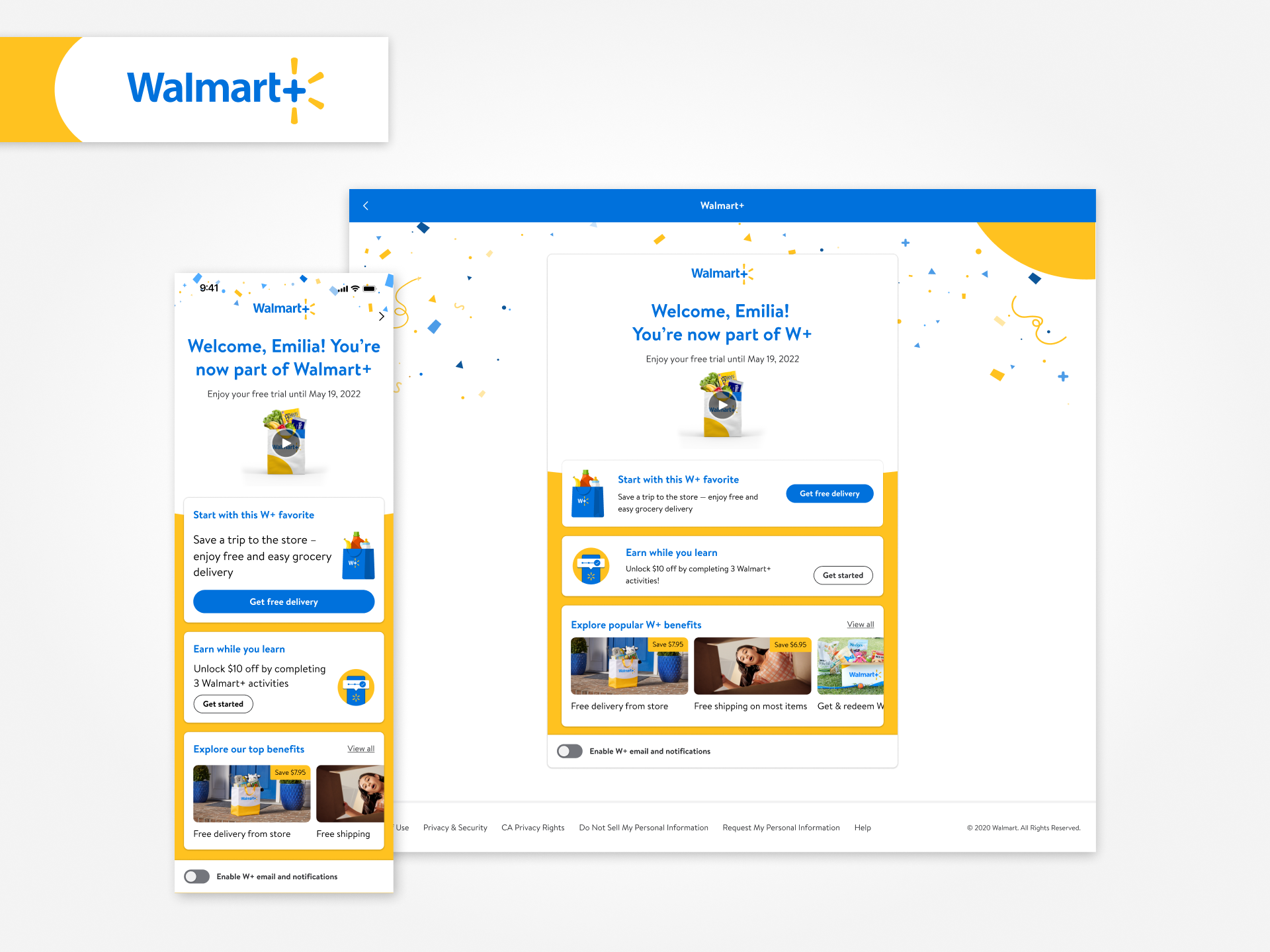
After exploring three concepts, I collaborated with design leadership to choose the promising third concept, emphasizing education and interactive onboarding. It features an engaging video introducing membership benefits, including an “earn while you learn” feature offering $10 in Walmart Cash for completing three activities. The confirmation screen showcases personalized benefits and limited-time offers, creating a tailored experience.
Securing both approval and alignment from the Product team was crucial in ensuring seamless integration with the product vision. With a unified vision, I translated the approved mid-fidelity mockup into a high-fidelity design.

Concept 3: Education & Interactive Onboarding (IOB) Activation
the solution
Final High-Fidelity Mocks
After thorough reviews with Design leadership, Product, and the Accessibility team to address any potential concerns, I advanced to the final mockup phase for the native app, mobile web, and desktop interfaces.
Mobile Mock
Desktop Mock
user testing
Testing a New Feature
In our user testing phase, we engaged 300,000 of our members, divided into three distinct groups: trial users, direct-to-paid users, and reactivated users, with each group consisting of 100,000 participants. This comprehensive approach allowed us to gauge the effectiveness of our new experience across a diverse range of customer segments within our user base. By segmenting our testing pool in this manner, we aimed to gain insights into how well the new experience resonated with different user types, ultimately informing our decision-making process.
results
How Did It Perform?
The feature achieved remarkable success across all user categories! Trial users, direct-to-paid users, and reactivated users all experienced an increase in basis points (bps) for one or more benefits, with the most substantial improvement observed among reactivated members at 0.99% (+99 bps). Additionally, there was a notable uptick in users utilizing the free delivery and free shipping options within 7 days of signing up or reactivating, with the most significant boost seen among reactivated members at 0.83% (+83 bps). Lastly, there was a reduction in users not utilizing any benefits, with the most impressive reduction observed among reactivated members at -0.80% (-80 bps). To visualize these metrics, please consult the chart below.
| Member type | 0 benefits used (within 7 days) |
1 benefit used (within 7 days) |
2+ benefits used (within 7 days) |
Free delivery & free shipping orders placed (within 7 days) | Paramount+ activations (within 7 days) |
|---|---|---|---|---|---|
|
|
|
|
|
|
|
|
|
|
|
|
|
|
|
|
|
|
reflection
Final Thoughts
In summary, our efforts to enhance the underwhelming onboarding experience yielded significant success, resulting in increased benefit utilization across all member categories. This revamped experience effectively addressed the previous challenge of low engagement within the first 90 days. As a team, we collectively crafted a more personalized experience that not only elevated early membership engagement but also improved our Time-to-Purchase (T2P) metrics.